Food for thought
Posted on: November 2, 2009
What Do I Desire?
To learn and gain new knowledge.
IMM: Research CD Title (Assignment)
Posted on: July 14, 2009
What is a multimedia CD-ROM title?
It is a compact disc that contains a title as a menu to let the audience control what they want to view and to enhance interactions with the users. Users are able to interact by manipulating the controls to view with the content of the CD-ROM.
What are some application of CD-ROM title design? Eg. Educational. Bring examples, if any.
The application of CD-ROM title design ranges. From kids education, games, presentations, Softwares, Softwares tutorial, business informations to information chart.
What are the differences between website design and CD-ROM title design?
- Website can be access world wide whereas some CD-ROM are only available in a smaller region of the world.
- The space for a web design range from 4-5mb while the maximum space for a CD-ROM can go up to 700mb.
- Website design consist of 3 section: Header, Main content and Footer. However, CD-ROM title design does not contain footer.
IMM: Delicious Account
Posted on: June 9, 2009
Click: delicious.com/Valentinaxoxo
Webdesign: This Fashion Flowchart
Posted on: May 25, 2009
IMM Assignment 1.1
Posted on: May 25, 2009
The two good examples of a good personal experience
- It must be interactive
- It is a personal experience
- No gore, violence or pornography
A game of MONOPOLY: The World Edition
Introduction
Everyone knows and remembers the rule and regulation of playing the Monopoly board game. It’s still the most popular, widely played, and best-selling board game in the world! The aim of the game is to be the only player left in the game after everyone else has gone bankrupt.
There are many great landmarks within the cities that was printed on the Monopoly board and we could gain new knowledge of the different landmarks in the game itself.
The World Edition Monopoly board game uses cards(as credit cards) instead of cash. There’s also an electronic banking unit which makes receiving and paying money, transactions between players easy for the banker.
(Summarize)
Why this is one of my 2 examples of good personal experience?What other games you could name these days that brings back so many memories of family fun. No other game has turned so many game playing moments into memories! It’s filled with surprises and that you’ll never know who would go bankrupt the next second. Personally, I usually play with my family and I felt that it’s an innovative and interactive game experience.
Keywords
Fun, Innovative
Journey to the West: Food Run
Introduction
It was a trail on researching food around the West side of Singapore. We went to places at the West side to taste their best local dishes with a given amount of money by the organizer. With the given amount of money, we have to reach a certain destination on time and taste the food instructed my the organizer. Our team found 8 dishes out of 10.(It’s sort of like the TV Variety show by Jacky Wu-十字路口 “Shi zi lu kou”)
However, after we were done with our Food Hunt, we have to brainstorm as a group to create a new and improvise food.
Credits to: Ahmad Robin for posting up in YouTube
In the clip itself, it showcase of my team’s booth; The most eye-catching, dynamic, flowery, colorful one. And of cause, I did my part in designing the booth while the rest of my team mates battling out in the food lab.
(Summarize)
Why this is one of my 2 examples of good personal experience?It test our Entrepreneurship, Team Work, Culinary skills and Creativity. It’s also an Inter-School exchange (with my neighboring Secondary Schools) programme, which allows interaction with your team-mates and the other schools. After going through this Food Run which was organise by my previous neighboring Secondary School (Teck Whye Secondary School), I’ve learned something that’s beyond the books and the experience shared in this Workshop is interactive and interesting.
Keywords
Fresh/New, Interesting.
Homework IMM
Posted on: May 25, 2009
Questions
What is Web application?
Web application is an application in a web page that allows interaction with the users. For example like media players (Music), Videos, Mini games.
What is the difference between web-application and Web Design?
A Web Design is the presentations of the layout of the overall web page using design fundamentals, typography, authoring skills… etc. It’s actually the main subject that sub-link to everything in a flowchart. Whereas, Web application is the “process” of designing a Web.
Create a website based on flowchart given:
I have upload to my domain: MM Flowchart
I ♥ Homework
Posted on: May 22, 2009
Visit http://www.thisfashion.com.sg and make and analysis by answering the following questions:
How do you find this site? (In 3 words)
THE THREE “S”
Still: There’s no flash or cool navigation to play around with. The website is just quiet and doesn’t interact with the users.
Simple: The website has a really simple layout and it make the page look less interesting. It’s not consider a bad design, just because the designer of the particular website did not attempt to design it. Therefore, is just plain “Dull” in my opinion.
Shallow: It gives the user little content what the page is about. Hence, it’s unclear in it’s purpose of what the site is about.
Who do you think the site is created for?
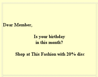
The site is created for regular customers of This Fashion. I’ve notice that when I’ve access to the Index page of the website, I was greeted “Dear members, Is your birthday this month? Shop at This Fashion with 20% disc”
Please note the bold in it’s statement:
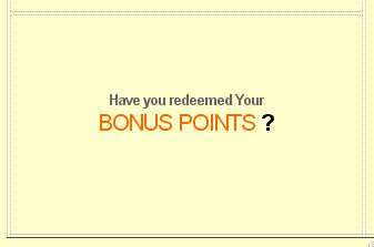
Please note that there’s no any navigation to a new page or what-so-ever in the image below(It’s a flat image):
From the 2 above pictures, I can conclude that from the index page of this website, it only target on “members” of it’s shops. For someone who accidentally came across this website won’t understand “Have you redeemed your Bonus points?” This shows that the web designer have no intention of explaining what Bonus points is or gives an inter-link to further explain. It’s as if the visitor of this particular website SHOULD understand what it means.
The site is also created for the “members” or the regular customers of This Fashion to find the locations of different outlet of the shops and the Terms and Conditions of purchasing their items.
What are the good attributes of the sites? (in terms of usability, aesthetic issues, etc)
Remember “The Three S” I’ve mention in my first question? One of the three S is Simple. Yes, although earlier I mentioned the definition of Simple is Dull, it also meant to be one of the positive attributes of this website.
The layout is simple and it’s suppose to be user-friendly. The navigation is straight forward and there’s not much choices to make. The user don’t have to figure out which navigation to go as it’s position right below the heading.
Fortunately, the texts are not made of any fancy fonts. It’s neat and the user could read with ease without staring at the screen to read the text. The color combinations of the font and background is clear.
What are the bad attributes?
Dull and with little content. First-time users won’t know what’s the purpose of this website is about, what’s it promoting as it’s too broad as mention in the “Services” content. The content is not clear and the user can only access through the navigation and nothing else. The website is boring and it does not attract the attention of the user. The use of a table in a official website is also not appropriate as not all the browsers support html table.
Interactive Multimedia Flowchart
Posted on: May 17, 2009
Flowchart done by:
- Veronica (your truly)
Group members:
Flowchart 1 (Group)
Flowchart 2 (Group)
Flowchart 3 (Group)
Flowchart 4: Potential Employer(An Engineer)


 18
18